Your events.
Running beautifully.
Brand at a glance
Who we are
Evessio is event management software for awards and conferences — one platform that runs a programme end to end, from the first entry to the final applause.
Positioning line
"Your events. Running beautifully."
The essentials
Name evessio (always lowercase)
Logo type VAG Rounded
Brand colours Purple #584898 · Teal #40A395
Display / body Fraunces / Figtree
Tone Warm, plain-spoken, confident
Positioning & story
Most teams run a programme across four or five disconnected tools. Evessio replaces all of them with a single, connected platform — for every team involved.
Logo & wordmark
The Evessio wordmark is the brand's primary signature: the name evessio set in lowercase in VAG Rounded, with a distinctive teal dot.
Wordmark only

Use once the brand is established on the page — site headers, in-product, repeat mentions.
With strapline
Use for first impressions and standalone contexts — covers, signage, adverts, social profiles.
↓ Download Evessio logos (all formats)
Construction & colour
Typeface: VAG Rounded, set lowercase.
The wordmark and dot are two distinct colours — never recolour them individually outside the approved one-colour versions.
| "evessio" wordmark | #584898 RGB 88·72·152 · CMYK 79·84·4·0 |
| The dot | #40A395 RGB 64·163·149 · CMYK 73·15·48·1 |
- Use the supplied master artwork — don't retype the name.
- Keep clear space around the wordmark equal to the height of the "e".
- Pick the strapline or wordmark version to suit the context.
- Change the typeface, recolour, rotate, stretch or capitalise.
- Reproduce the dot in any colour other than the brand teal.
- Place on a busy or low-contrast background.
Reverse-out (white) logo
On dark, brand-colour and gradient backgrounds, use the reverse-out (all-white) version of the logo. It keeps the wordmark legible where the full-colour logo would not read. Always ensure strong contrast, and never place the white logo on a light or busy background.
On solid brand colours
On graduated backgrounds
Colour palette
Built on the two logo colours — a confident purple and a fresh teal — grounded by ink and lifted by a single magenta for action.
Background tints
Lavender · Light Lavender · Mint · Blush · Off-white · White — keep them quiet; they support content, never compete with it.
Typography
Two typefaces do all the work: Fraunces for expressive display, Figtree for clear, friendly text.
beautifully
High-contrast serif at black (900) weight for headlines and pull quotes.
events team
Geometric humanist sans for body, UI and labels. Weights 400–900.
- One Fraunces headline per view — let it breathe.
- Body copy in Figtree at comfortable size and line-height.
- Short, punchy fragments for impact lines.
- Set body text or long paragraphs in Fraunces.
- Use more than two weights of Fraunces in one layout.
- Set long phrases in all-caps.
Voice & tone
We sound like a sharp, warm colleague who has run a hundred events — confident, plain-spoken, never salesy. "No pitch. No pressure. Just a conversation."
Principles
Human, not corporate. Write like a person talking to a person.
Clear over clever. Plain words, short sentences, no jargon.
Outcomes first. Lead with the benefit, then the feature.
Confident, not boastful. Back claims with real numbers.
Rhythm & punch. Short fragments. Em-dashes for a beat.
- "From the first entry to the final applause."
- "One login. Every team. Zero gaps."
- "Days not weeks."
- "Leverage our best-in-class synergistic solution."
- "Revolutionary, world-class, game-changing…"
British English — programme, recognised, organise, colour. Sentence case for headings and buttons. Numerals for stats.
Imagery, iconography & illustration
Imagery shows the product doing real work and real teams getting results — confident, bright and uncluttered.
Illustration library
Two complementary styles are available — use one consistently within a single piece; don't mix sets on the same page.
Set 1 — Flat geometric (primary)
Bold, flat, geometric scenes in brand purple and teal with magenta highlights. The primary choice for marketing pages, features and section headers.


Set 2 — Remote-work lifestyle
A softer, character-led set for blog, resources and people-focused content. Many illustrations available.


All illustrations live under …/Evessio_News_Website/<name>.svg — more are available than shown here.
UI, buttons & gradients
Clean, rounded components with a clear hierarchy of action — one primary action per view.
Buttons
Primary — magenta fill, white text, 9px radius. Secondary — ghost/outline. Tertiary — deep purple. Sentence case, often closed with "→".
Gradient (graduated) surfaces
Graduated boxes blend two brand colours for hero panels, feature blocks and stat callouts. Keep gradients within the brand family; reserve purple→magenta for high-energy moments. Set type in white and check contrast.
Brand in context
How it all comes together — the live website and the awards journey.
Homepage
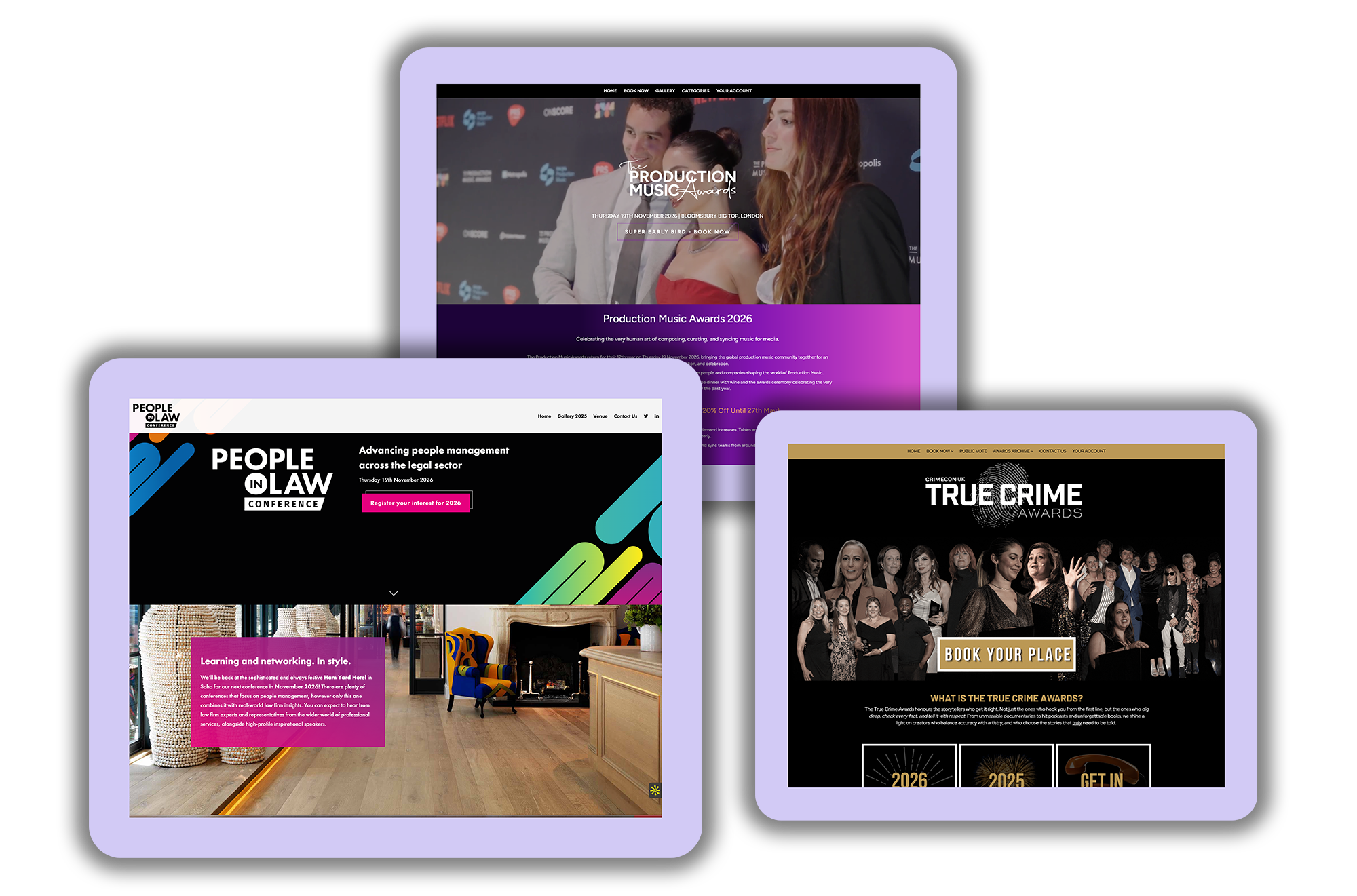
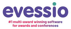
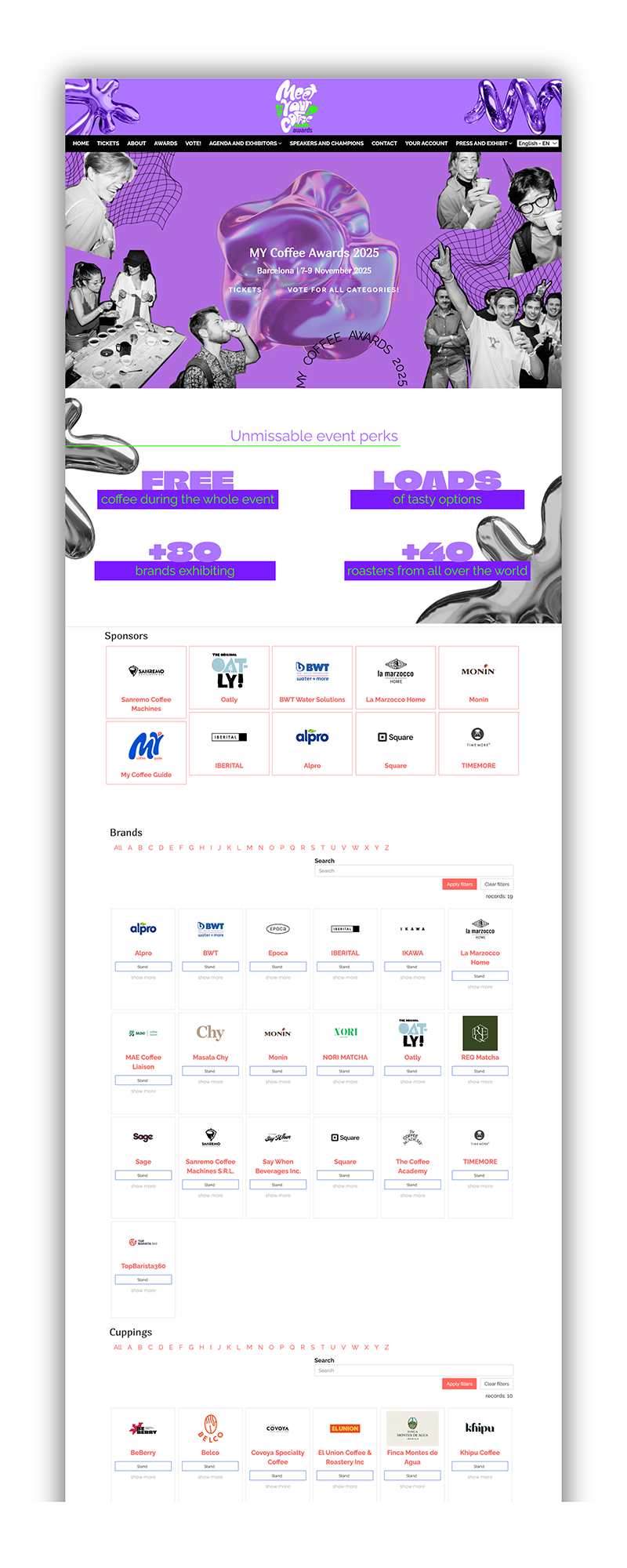
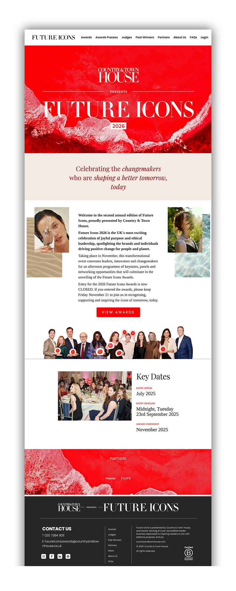
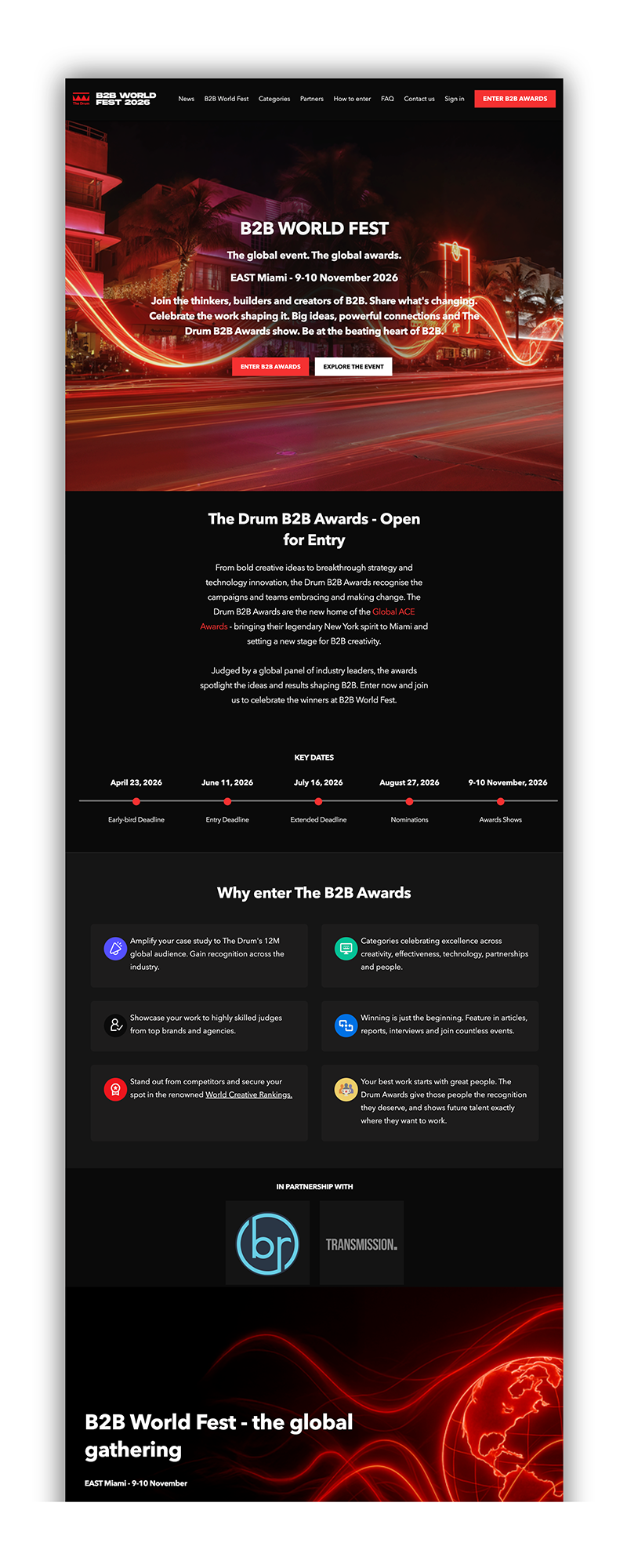
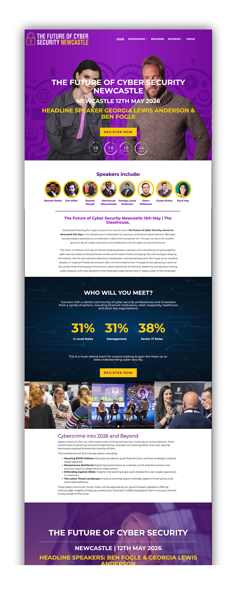
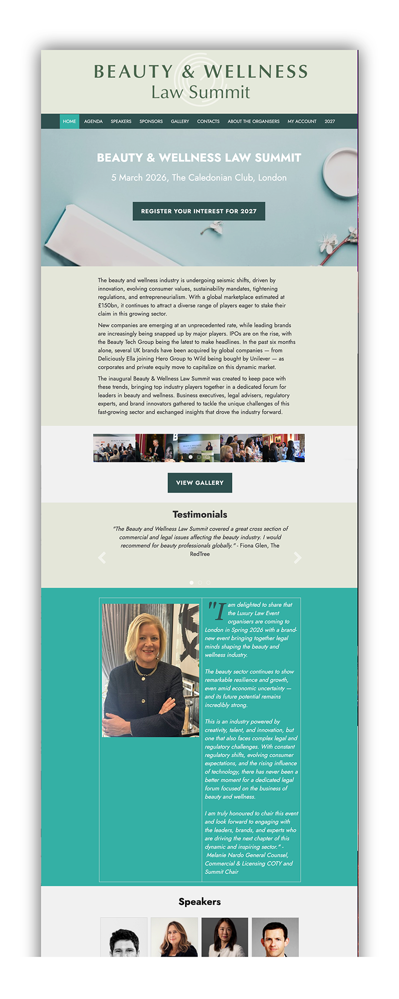
Customer programmes built on Evessio
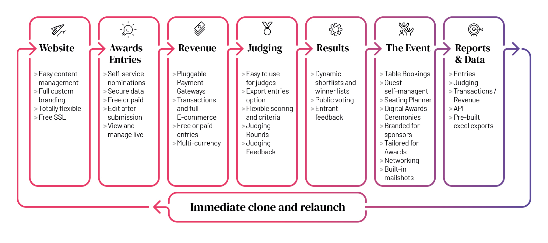
Awards flow
The master awards flow diagram —
Awards flow — graduated boxes
The "launch to applause" journey as graduated boxes blending purple into teal.
What's New
An independent, editorial style for communicating new and upcoming features and releases. It shares the Evessio fonts but uses a warmer, standalone palette so product news feels distinct from the core brand.
Palette
Status badges
Headlines in Fraunces, body in Figtree. Editorial, first-person tone — e.g. "A note from the team" and "a peek at what's coming next."
In context
What's new in Evessio.
The latest releases, the upgrades they bring, and a peek at what's coming next.
Stop rebuilding the same Speaker, Judge and Sponsor profiles every season — search, import and clone.
Read the full article →Live at evessio.com/live/en/page/new-features-development
Applications & governance
The brand in 30 seconds
▸ Wordmark evessio in VAG Rounded — supplied artwork only.
▸ Purple #584898 + teal #40A395 are the brand.
▸ Magenta #E5005B for action — used sparingly.
▸ Fraunces headlines, Figtree everywhere else.
▸ Warm, plain-spoken, outcome-led copy.
Asset library
Master logos, the illustration sets, fonts and templates are held centrally — always start from supplied artwork.